

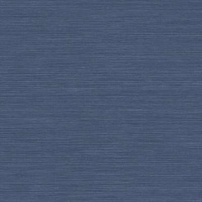
Coastal Hemp Ocean Blue Wallpaper
Find It Here
I earn a commission if you make a purchase, at no additional cost to you.
For more info, see my Disclaimer page.
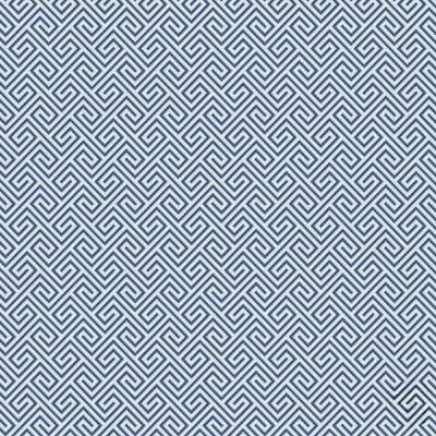
Beach Keys Blue Wallpaper
Find It Here
I earn a commission if you make a purchase, at no additional cost to you.
For more info, see my Disclaimer page.
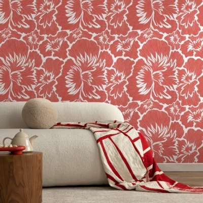
Coral Floral Peel and Stick Wallpaper
Find It Here
I earn a commission if you make a purchase, at no additional cost to you.
For more info, see my Disclaimer page.
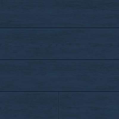
Coastal Blue Shiplap Wallpaper
Find It Here
I earn a commission if you make a purchase, at no additional cost to you.
For more info, see my Disclaimer page.
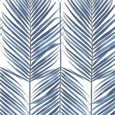
Paradise Palms Coastal Blue Wallpaper
Find It Here
I earn a commission if you make a purchase, at no additional cost to you.
For more info, see my Disclaimer page.

Taupe Floral Peel and Stick Wallpaper
Find It Here
I earn a commission if you make a purchase, at no additional cost to you.
For more info, see my Disclaimer page.


Blue-Tan Grasscloth Wallpaper
Find It Here
I earn a commission if you make a purchase, at no additional cost to you.
For more info, see my Disclaimer page.
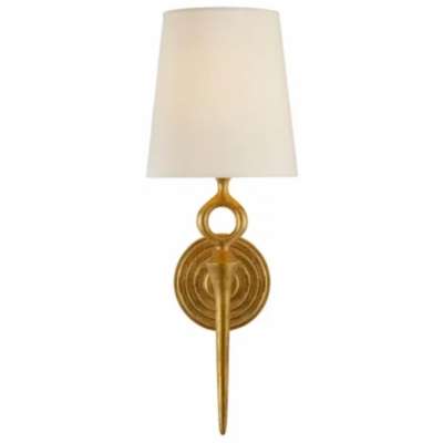
Bristol Sconce 18"H
Find It Here
I earn a commission if you make a purchase, at no additional cost to you.
For more info, see my Disclaimer page.
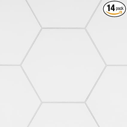
Matte White Hex Porcelain Tile 9x10
Find It Here
$59.54
I earn a commission if you make a purchase, at no additional cost to you.
For more info, see my Disclaimer page.
06/30/2025 04:27 am GMT
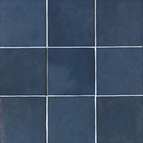
Blue Ceramic Tile 5x5
Find It Here
$7,008,647.00
I earn a commission if you make a purchase, at no additional cost to you.
For more info, see my Disclaimer page.
06/30/2025 04:27 am GMT

Wavy Gold Wall Mirror
Find It Here
$79.19
I earn a commission if you make a purchase, at no additional cost to you.
For more info, see my Disclaimer page.
06/30/2025 04:29 am GMT

Woven Cotton-Jute Rug 8x10
Find It Here
$179.99
I earn a commission if you make a purchase, at no additional cost to you.
For more info, see my Disclaimer page.
06/30/2025 01:07 pm GMT

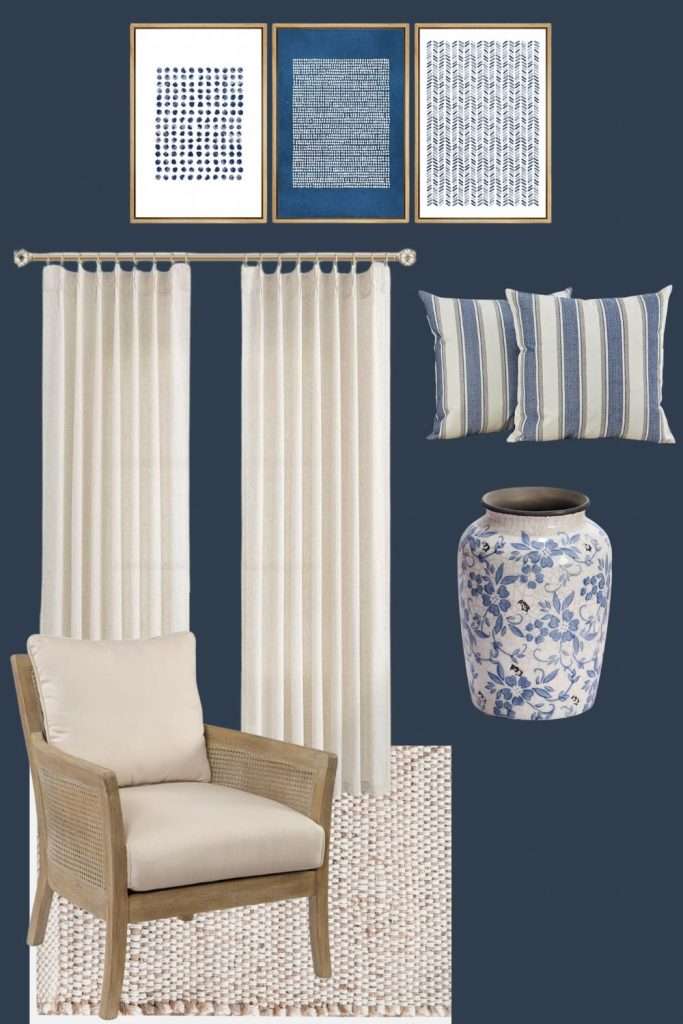
Framed Wall Art, Set of 3
Find It Here
$104.78
I earn a commission if you make a purchase, at no additional cost to you.
For more info, see my Disclaimer page.
06/30/2025 01:08 pm GMT

Blue and White Vase
Find It Here
I earn a commission if you make a purchase, at no additional cost to you.
For more info, see my Disclaimer page.

Striped Throw Pillow Covers 20"
Find It Here
$17.00
I earn a commission if you make a purchase, at no additional cost to you.
For more info, see my Disclaimer page.
06/30/2025 01:08 pm GMT

Pinch Pleat Linen Curtains 84"
Find It Here
$29.98
I earn a commission if you make a purchase, at no additional cost to you.
For more info, see my Disclaimer page.
06/30/2025 01:08 pm GMT

Encore Cane Armchair
Find It Here
I earn a commission if you make a purchase, at no additional cost to you.
For more info, see my Disclaimer page.

Samplize-SW Charcoal Blue 2739
Find It Here
I earn a commission if you make a purchase, at no additional cost to you.
For more info, see my Disclaimer page.

Samplize-SW Snowbound 7004
Find It Here
I earn a commission if you make a purchase, at no additional cost to you.
For more info, see my Disclaimer page.

Samplize-SW Peppercorn 7674
Find It Here
I earn a commission if you make a purchase, at no additional cost to you.
For more info, see my Disclaimer page.

Samplize-SW Vogue Green 0065
Find It Here
I earn a commission if you make a purchase, at no additional cost to you.
For more info, see my Disclaimer page.

Samplize-SW Iron Ore 7069
Find It Here
I earn a commission if you make a purchase, at no additional cost to you.
For more info, see my Disclaimer page.

Samplize-SW Midnight 6264
Find It Here
I earn a commission if you make a purchase, at no additional cost to you.
For more info, see my Disclaimer page.

Samplize-SW Naval 6244
Find It Here
I earn a commission if you make a purchase, at no additional cost to you.
For more info, see my Disclaimer page.

Samplize-SW Pure White 7005
Get a Sample
I earn a commission if you make a purchase, at no additional cost to you.
For more info, see my Disclaimer page.

Samplize-SW Canvas Tan 7531
Find It Here
I earn a commission if you make a purchase, at no additional cost to you.
For more info, see my Disclaimer page.

Samplize-SW Koral Kicks 6610
Find It Here
I earn a commission if you make a purchase, at no additional cost to you.
For more info, see my Disclaimer page.

Samplize-Holiday Turquoise 0075
Find It Here
I earn a commission if you make a purchase, at no additional cost to you.
For more info, see my Disclaimer page.

Samplize-SW Paper Lantern 7676
Find It Here
I earn a commission if you make a purchase, at no additional cost to you.
For more info, see my Disclaimer page.


